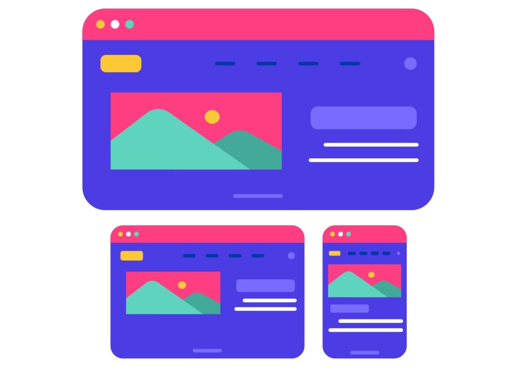
Browsing the internet on mobile devices is now as popular as on desktop computers, making responsive web design an essential part of creating visually appealing and functional websites. Mobile devices are becoming increasingly important, so designing responsive websites in WordPress is a crucial step to reach a wider audience.
Why responsive design is key for WordPress?
Responsive design is an approach to building websites that automatically adapts to different screen sizes and devices. In the case of WordPress, responsiveness is not just an option; it’s a standard that helps websites better meet user expectations. Here’s why responsive design is essential for WordPress:
- Improved user experience. A well-designed responsive WordPress site provides users with a seamless and consistent experience, whether they are using a computer, smartphone, or tablet.
- Google algorithm compliance. Google, the world’s most popular search engine, favors responsive websites in search results. Responsive design can have a significant impact on your site’s Google rankings.
- Increased reach. In today’s world, many people use mobile devices to browse the internet. If your website isn’t responsive, you may lose potential visitors.
- Easier content management. With responsive design, you can manage a single website, and the content will adapt to different devices. You don’t need to create separate versions for desktop and mobile.
How to design a responsive WordPress website?
Here are a few steps to design a responsive WordPress website:
- Choose a responsive WordPress theme. When selecting a WordPress theme or template, make sure it’s responsive. Check how it looks on different devices and whether it adjusts to changes in screen orientation.
- Customize content for different devices. Using the tools available in WordPress, customize the appearance and layout of your site for different devices. Ensure that text is readable, images are appropriately sized, and buttons are easy to click on a touchscreen.
- Test on various devices. Before publishing your site, test it on various mobile devices, tablets, and computers. Ensure that all elements work correctly and that the site is readable and intuitive on every device.
- Use responsive plugins. There are many WordPress plugins that can assist in creating responsive websites. Some of them automatically adapt content for different devices.
- Monitor performance. Responsiveness can affect a website’s performance, especially on mobile devices. Make sure your site loads quickly to avoid discouraging visitors.
In Conclusion
Responsive design is an integral part of creating WordPress websites. It provides a better user experience, expands your site’s reach, and positively impacts search engine rankings. By selecting the right theme and adjusting content for different devices, you can create an attractive and functional website that attracts visitors, regardless of the device they use.
Let’s Build Something Great
Ready to discuss your project or potential partnership?