
As a business owner or website developer, make sure your website is responsive. In this article, we will explain what a responsive website is, we will discuss the benefits of responsive website design.
We will also share some tips and best practices for responsive web design. So let’s dive into it.
What is a responsive website?
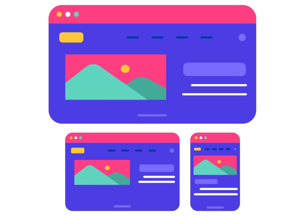
A responsive website is one that has been designed to provide an optimal viewing experience on a variety of devices such as desktops, tablets and smartphones. The website automatically adapts to the size and orientation of the screen of the device.
This ensures that visitors have a pleasant experience when they visit your website, regardless of the device they are using. Responsive websites are also designed to load quickly, which helps improve user experience and search engine rankings.
Responsive web design is becoming more and more popular and is now considered the standard in web design. This is due to the growing number of people accessing the internet using mobile devices.
Benefits of responsive web design
There are many benefits to having a responsive website. Here are some key benefits:
- Improves user experience: Responsive web design optimizes user experience by automatically adapting the page to the user’s device. This ensures that visitors have a pleasant experience when they visit your website, regardless of the device they use.
- Reduces maintenance costs: Responsive websites require less maintenance than non-responsive websites. That’s because they only need to be updated once, instead of multiple times for different devices and platforms.
- Increases traffic: Responsive websites are more likely to rank higher in search results, which increases the chances of potential customers finding your site.
- Strengthens your brand image: Responsive websites give visitors a positive impression of your brand, which is essential for building customer loyalty.
- Improves accessibility: Responsive websites are more accessible to people with disabilities, such as visually impaired.
Creating a responsive website
Creating a responsive website is not as difficult as it may seem. There are several methods you can use to create a responsive website such as using a content management system (CMS) or hiring a web designer. Each method has its advantages and disadvantages.
If you are familiar with web design, using a CMS is the best way to create a responsive website. Most popular CMS like WordPress are designed to be responsive and easy to customize.
Hiring a web designer is the more expensive option, but also the most reliable. A web designer can create a custom responsive website that is tailored to your specific needs. It’s also a good option if you don’t have the time or technical skills to create a website yourself.
Let’s Build Something Great
Ready to discuss your project or potential partnership?