Astratic theme includes a set of CSS classes that will help you to make some extra adjustments or changes while building any kind of custom layout (for example landing page). These classes are very easy to use and can be applied in different elements like Gutenberg blocks. Its purpose is to help more advanced users to perform little tweaks right in the content editor, so it’s not necessary to edit the source code on the served.
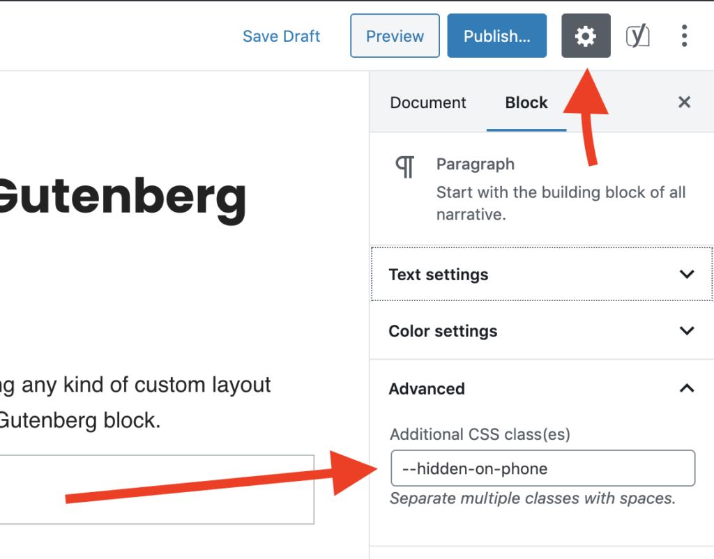
To use such class in a block you need to navigate to Settings sidebar (check the screenshot below) and then open the Advanced tab.

Custom CSS classes
* Available if you use Astratic theme
Applicable to all blocks
--hidden-on-phone– if you want to hide the element on mobile devices (below 768 px screen width)--hidden-on-tablet– hides the element on tablet (screen width from 768 to 1199 px)--hidden-on-desktop– hides the element on desktop devices (screen width more than 1199px)--disable-margin-top– disables top margin of the block--disable-margin-bottom– disables bottom margin of the block--disable-vertical-margins– disables both top and bottom margins
*Please note that disabling top or bottom margin in one block doesn’t mean that a free white space will disappear. To remove it do the same with upper/lower block too.
Block Columns
--cols-disable-horizontal-margins– disables horizontal margins in the Columns Block; this class has to be applied to the Columns Block, not to the single column- –cols-disable-vertical-margins – disables vertical margins in Columns Block; this class has to be applied to the Columns Block, not to the single column
--col-height-100– sets the height of a given element (e.g. a group) to 100% of the Columns Block height; added to a given block in a column; an example of use: when a group has one column with a background and a photo in the other column, this class makes both columns of the same height.
Block Group
--vertical-align-center– center vertically the content of the Group Block
Block Cover
--linked– if we add a link in the Cover Block, the entire block area will be linked, the link must be inserted directly in the block as the first element--linked-text-on-hover– adding a link in the Cover Block makes the entire block area will be linked; the link text in a normal state is hidden and shown on hover
Main navigation menu (not a block)

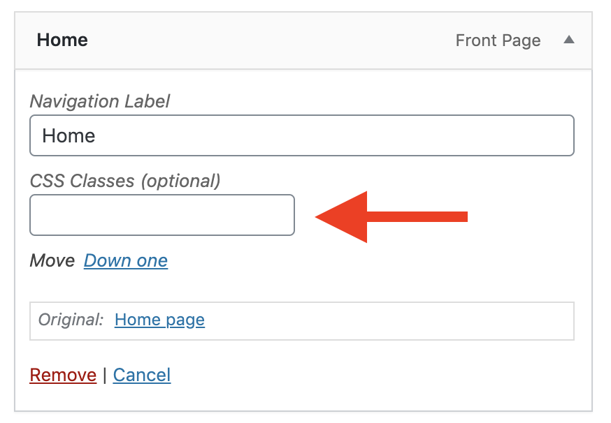
These classes can only be used in menu items setting. Navigate to Appearance > Menu and then use the Screen Options tab at the top of the page. Make sure Show advanced menu properties > CSS Classes checkbox is checked. Then you should see CSS Classes input whenever you edit or create new menu item.
--label– the class added for the menu changes its appearance in the mobile version; an example of use: creating a custom mobile menu (when is different than desktop version); on the desktop, the item with this class will not be displayed--button– a menu element with this class takes the appearance of a button
If anything in the list is unclear, please – let us know! We are here to help 🙂
