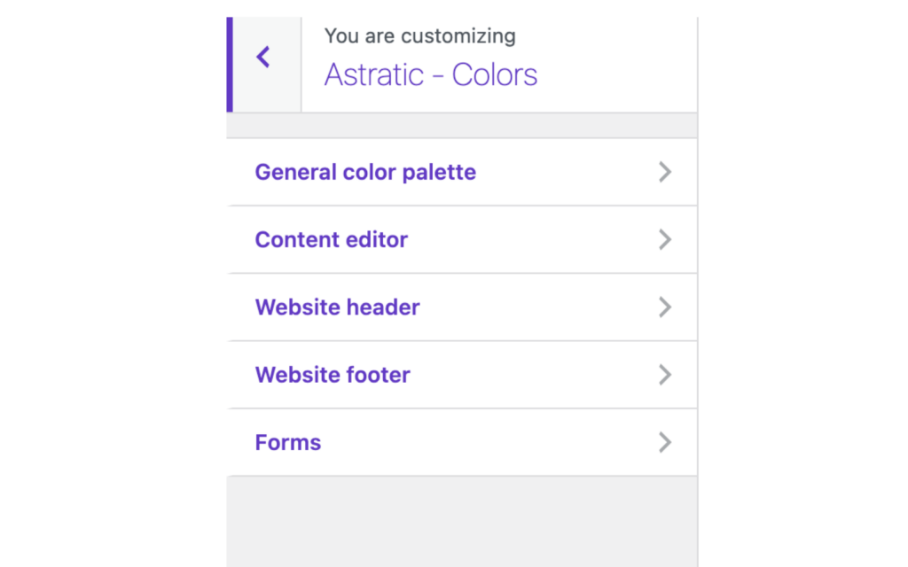
Here you will find a quick introduction on how to set up the colors using the color palette in Astratic theme. This settings can be found in the Appearance > Customize section in your WordPress admin panel. Here you have just four options to check – two main: general and editor color pallet, and two optional: website header and footer (which can be leave empty).
The general color palette is the place where you define the main colors for your website. In the content editor, you can use a few different colors which will appear just in the Gutenberg editor or just leave default ones defined in the general color palette. Colors for the website header and footer are useful only if you want a different look e.g. in the mobile menu. If you have no idea what to put here, leave it empty – the mobile look will be the same as on desktop.
General color palette
This is where you can configure the default colors of the basic website elements. With these settings, your website will immediately gain a unique character. When creating content and building new subpages, you will be able to set individual colors for most elements and blocks right in the content editor. This color palette is just the first step to build your new website fast and easily.
Options available in General Color palette:
Primary color
used as a separator color, the citation block color, in the pagination, as an H1 headline (title) in blog posts list
Site background color
used as a page background
Headings color
used for H2-H5 headings
Text default color
used for the body font
Text light color
used for the body font (lighter)
Link color
used for linked text
Button color
used for buttons
Action button color
used for buttons in WooCommerce, in a shop, as “add to cart” button, etc.
Light color
used as the background of the large version of the quote blocks, the background of the “code” block, “active” and “focus” form fields, as the background of the sidebar of static pages
Border color
used as a color of form fields’ borders, a separator, e.g. in sidebar or pagination
Alert color
used as validation; warning color (e.g. where there is incorrectly completed order or form)
White
used as default e.g., in buttons, form fields (should not be changed for no apparent reason)
Black
used as the background under the sticky menu (as in the case of white, should not be changed for no apparent reason)
Content editor
All the colors from the Content editor palette are in no way assigned to any page elements “permanently”. This palette is available only from the Gutenberg editor view. Here we can choose 6 colors that will be used for any elements (font, header, separator, etc.) when adding a new Gutenberg block.
For the visual consistency we recommend using colors described in the visual identity of the brand in the main palette as well as in the content editor palette.
Options available in Content Editor palette:
Brand 1
First brand color used in content editor (which can be used for any element)
Brand 2
Second brand color used in content editor (which can be used for any element)
Brand 3
Third brand color used in content editor (which can be used for any element)
Dark
Dark, used for any element in content editor
Light accent
Light, used for any element in content editor
Bright
Bright, used for any element in content editor
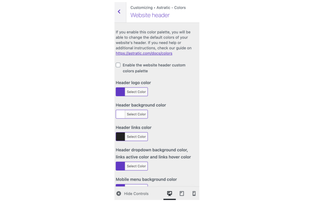
Website header
If you enable this color palette, you will be able to change the default colors of your website’s header.
Options available in Website header palette:
Header logo color
color used for the page name set in WordPress
Header background
color used for the background in header area
Header links color
used for linked text (just in header)
Header dropdown background color, link active color and links hover color
color responsible for the dropdown background (if we have a multi-level menu it shows up when you hover over the main dropdown item) and for the status of links in the main menu, i.e. for the color on hover and when the menu item is active
Mobile menu background color
color used for the background in mobile view
Mobile menu links color
color used for the links in menu in mobile view
Website footer
If you enable this color palette, you will be able to change the default colors of your website’s footer. This color palette is optional.
Options available in Website footer palette:
Footer background color
color used as a background in footer area
Footer headings color
color used for headings (just in footer)
Footer text color
color used for text (just in footer)
Footer links color
color used for links (just in footer)
Remember that two last palettes are optional and can be used if you need them. To change the settings for the header / footer mark the “Enable the website header/footer custom colors palette” option.
If you have any questions or challenges, please contact us!