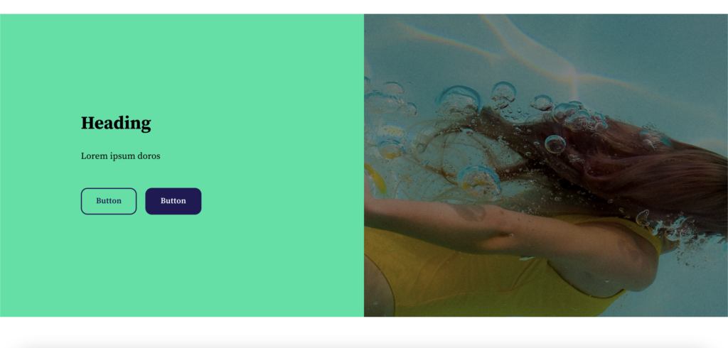
In the Astratic Theme, we have added new CSS classes that allow you to create an element in the full width of the screen. On one side there is a graphic / photo / movie and on the other side there is text on a colored background.
In addition, the element is responsive, it works so that on a small display the graphics / photo / movie will be positioned above or below (depending on what class we use) the text on the background.
How to use the CSS class?
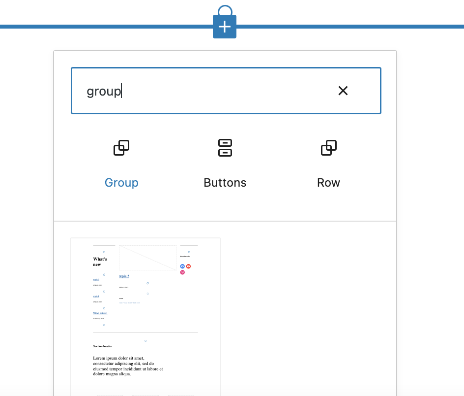
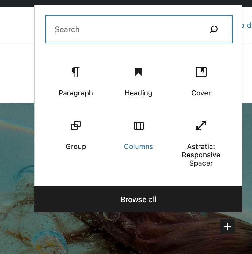
- In the editor, add a group block:
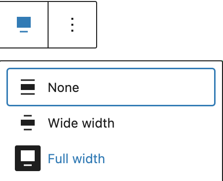
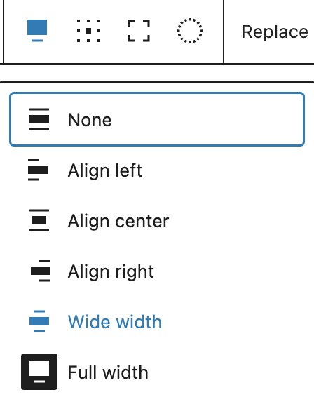
- Set group width to ‘Full width’
- In the block settings, add one of the 4 new classes
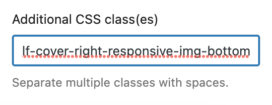
--half-cover-right-responsive-img-bottom
sets the photo / video on the right and with a small screen it sets the photo / video below the text
--half-cover-right-responsive-img-top
sets the photo / video on the right and with a small screen it positions the photo / video above the text
--half-cover-left-responsive-img-bottom
sets the photo / video on the left and with a small screen it sets the photo / video below the text
--half-cover-left-responsive-img-top
sets the photo / video on the left and with a small screen it positions the photo / video above the text
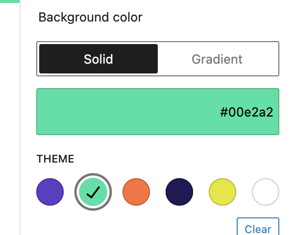
- Optionally, you can add a background color for the group
- In the group, insert the block ‘Cover’
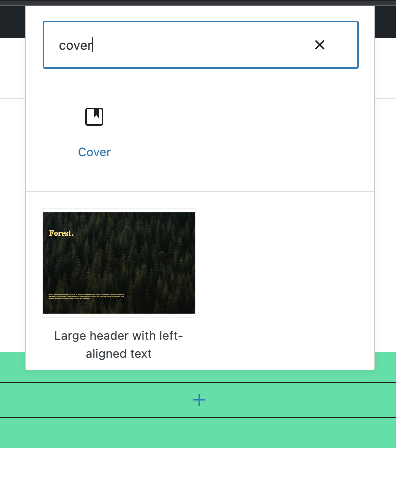
- For the ‘Cover’ block, select a photo or video from the media library as the background
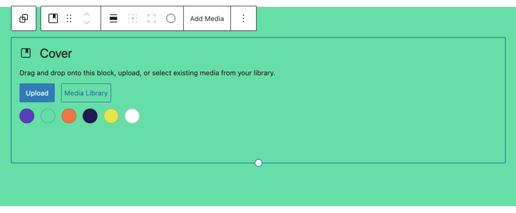
- Set the ‘Cover’ block to the full width of the screen
- In the ‘Cover’ block, click on the default paragraph and delete it.
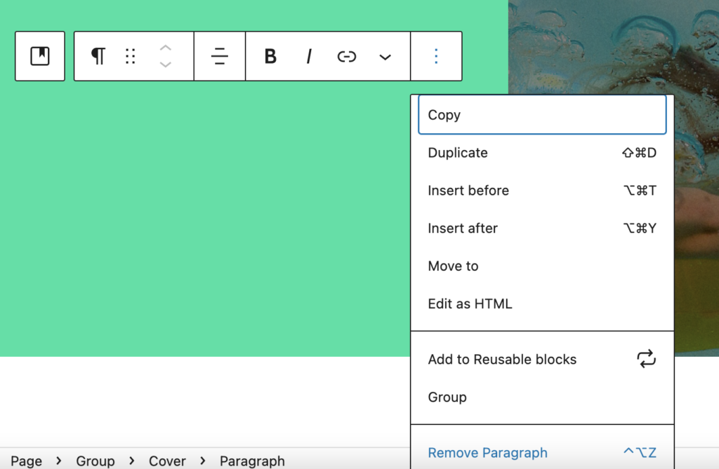
- In its place, put a ‘column’ block and set it to 2 columns.
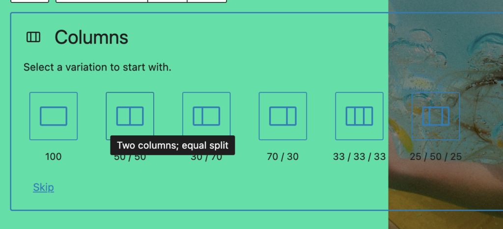
- In the columns you can add blocks according to the standard editor functionality. An example of use is shown in the photo below.
Have any questions? It there anything we can help? Write about it in the comments below ????